Lord Copper mining industry blog
Our studio was approached by the owners of mining industry blog - Lord Copper, providing news and updates on the world’s metal market. The brand was seeking a new visual identity. Our task was to create a logotype and a new design for the blog that would accurately represent Lord Copper's values and appeal to their target audience.
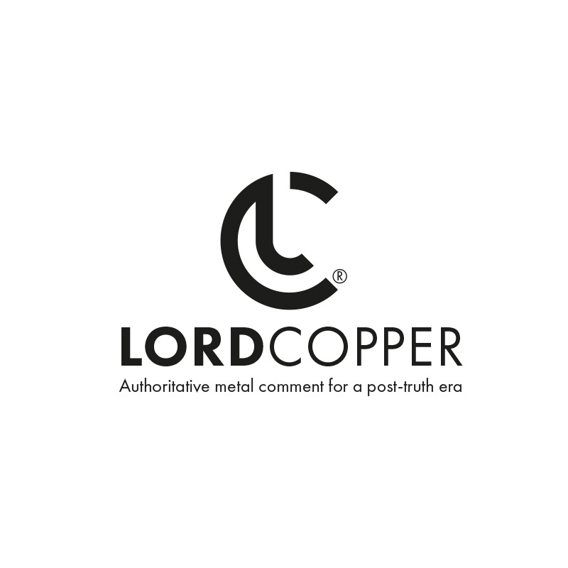
We wanted to create a visual identity that is modern, sophisticated, and reflects the mining industry's values at the same time. We chose to use the letters "L" and "C" from the blog's name to create a logotype. The logotype was designed in black to convey the seriousness and professionalism of the mining industry. We experimented with different layouts and typography until we found the perfect balance between simplicity and uniqueness.
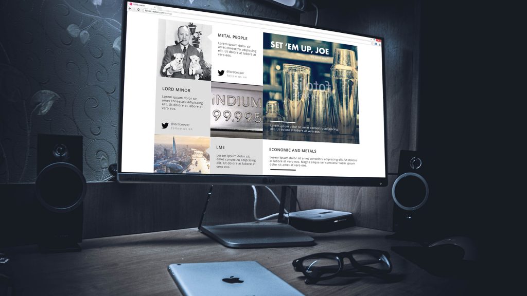
We designed the blog to be both visually appealing and easy to navigate, with a clear hierarchy of information and a focus on readability. The readers can find the latest news and insights from the metals market, presented in an engaging and informative manner.
Overall, we're extremely proud of the work we've done for Lord Copper. The logotype and website design we created perfectly capture the essence of the brand, while also providing an intuitive and enjoyable user experience for its readers.